EnginPlot

Features

A tour of everything EnginPlot does. Click a number on the screenshot to jump to that feature, or use the chapter list to browse.

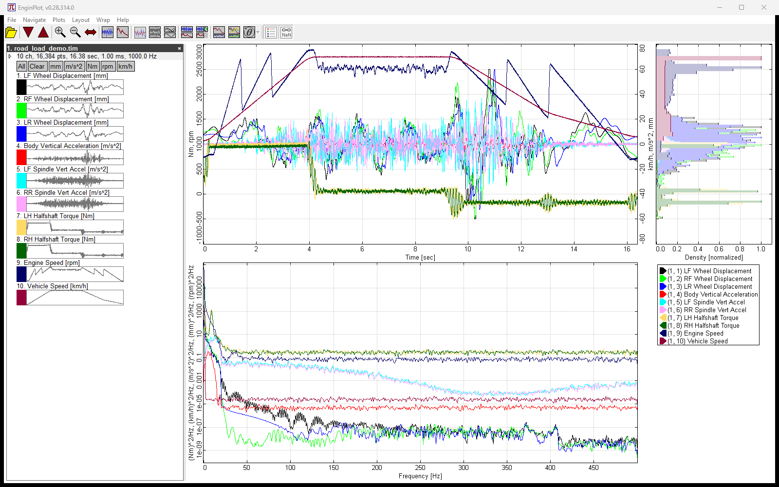
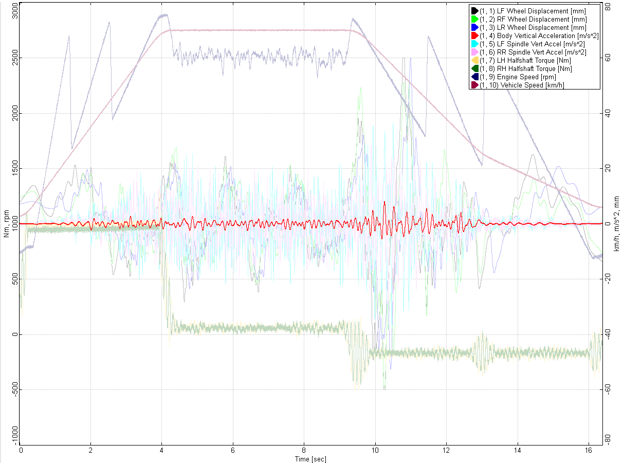
The EnginPlot window with ten channels of synthetic road-load data: channel thumbnails on the left, a time-history plot with two Y-axes at the top, a PSD plot below it, and a histogram and legend on the right 1 2 3 4 5 6 7
  1. File details
  2. Select by unit
  3. Channel thumbnails
  4. Automatic dual Y-axis
  5. Histogram
  6. Interactive legend
  7. Power spectral density

Load

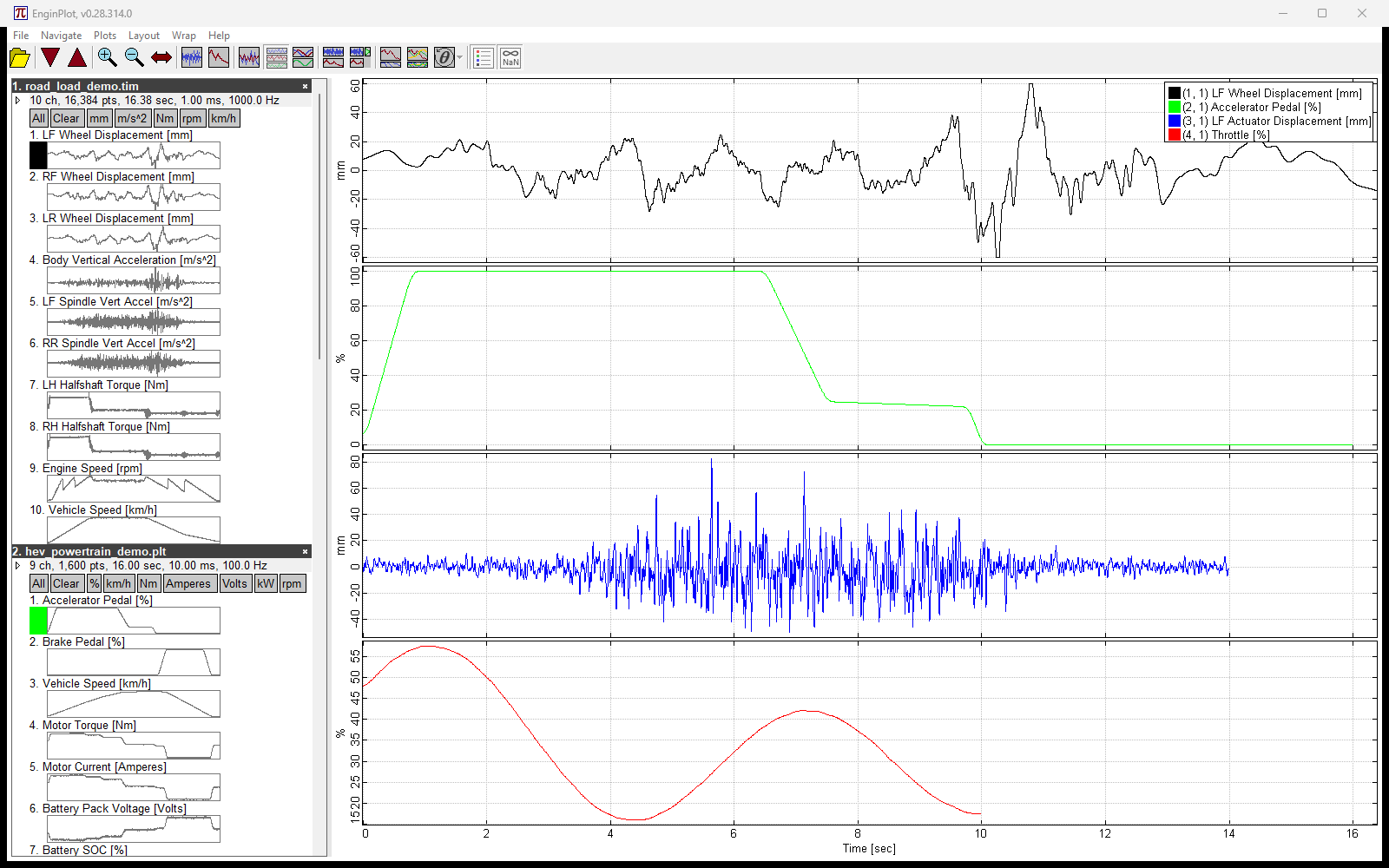
Four files open at once, one each of RPC3, PLT, fstrm and CSV, with one channel from each stacked in the plot

Reads what you already have

RPC3, PLT/SimCreator, fstrm/Moog Stream, CSV and space-separated text. Channel names and units are detected automatically, including units written inline as Name [unit] or Name (unit).

How: File → Open (which also lists recent files), or pass one or more paths on the command line.

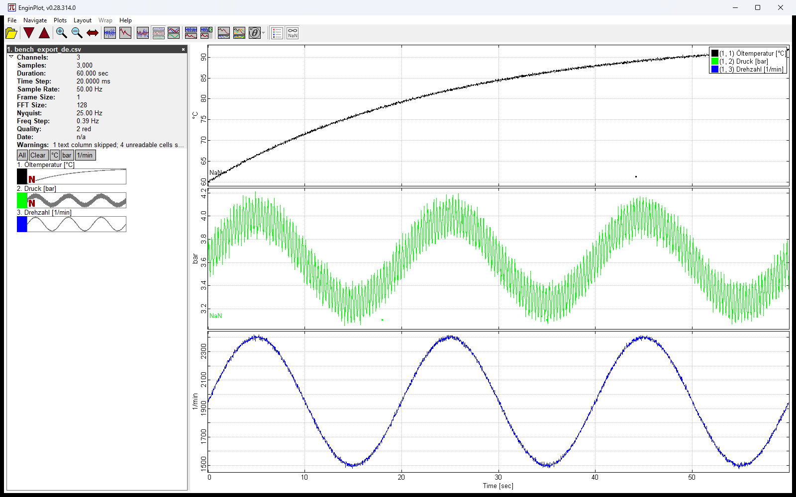
A German-language export with semicolons, decimal commas and a metadata preamble, opened with its three channels stacked and a Warnings row listing the skipped column and unreadable cells

Opens untidy CSV files

The reader works out its own delimiter and decimal separator, so a European export like 1,5;2,5 reads correctly. It handles quoted fields, skips instrument metadata above the header, and reads UTF-8, UTF-16 and BOM-prefixed files.

A cell it can’t read (N/A, a dash, a blank) becomes a gap in that channel instead of failing the whole file.

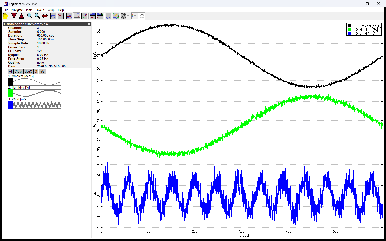
A CSV whose time column holds ISO date-time stamps, plotted in seconds, with the details pane showing the recording date and start time

Reads date-time stamps

A time column written as 2026-08-30T14:03:07.250, 08/30/2026 2:03:07 PM, 30.08.2026 14:03:07, a date and time in two columns, or a bare time of day that wraps past midnight all work. Day-first versus month-first is decided from the whole column, not guessed row by row.

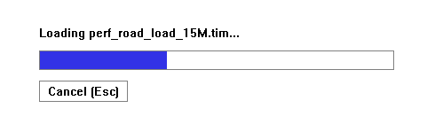
The plot area while a 600 MB file loads: a progress bar with the file name and a Cancel (Esc) button

Large files load without freezing

A progress bar with the file name and a Cancel button appears in the plot area while a file loads in the background. The rest of the window stays usable, so you can keep working with files that are already open.

How: press Esc or click Cancel to abandon a load.

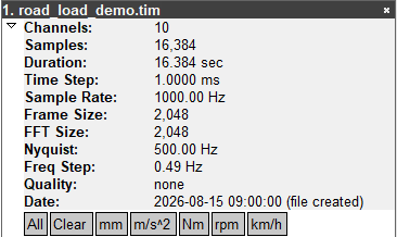
The expanded file details pane: channels, samples, duration, time step, sample rate, frame and FFT size, Nyquist, frequency step, quality and date

File details, including what was worked around

Every file shows its channel count, samples, duration, time step, sample rate, FFT settings and recorded date. A Time row says what the time column did, and a Warnings row lists anything the reader had to work around, so a file that loads leniently never loads silently.

The header row of an open file, with its close button circled

Close one file, keep the rest

Each open file’s row in the tree has a close button. Closing removes its channels from the plot and leaves everything else selected.

View

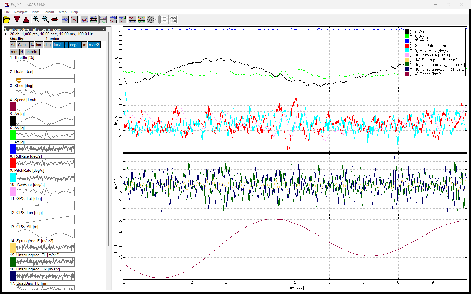
Ten channels in four units stacked by unit: g, deg/s, m/s^2 and km/h each get their own row and scale

Layouts that fit the data

Overlay every channel on one plot, stack them one per row, or group rows by engineering unit so each unit gets its own scale.

How: Layout → Overlaid, Stacked, or Stacked by Unit.

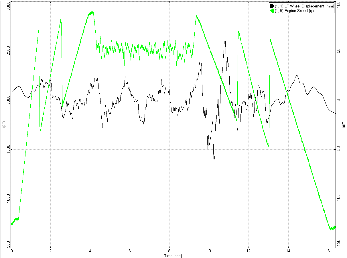
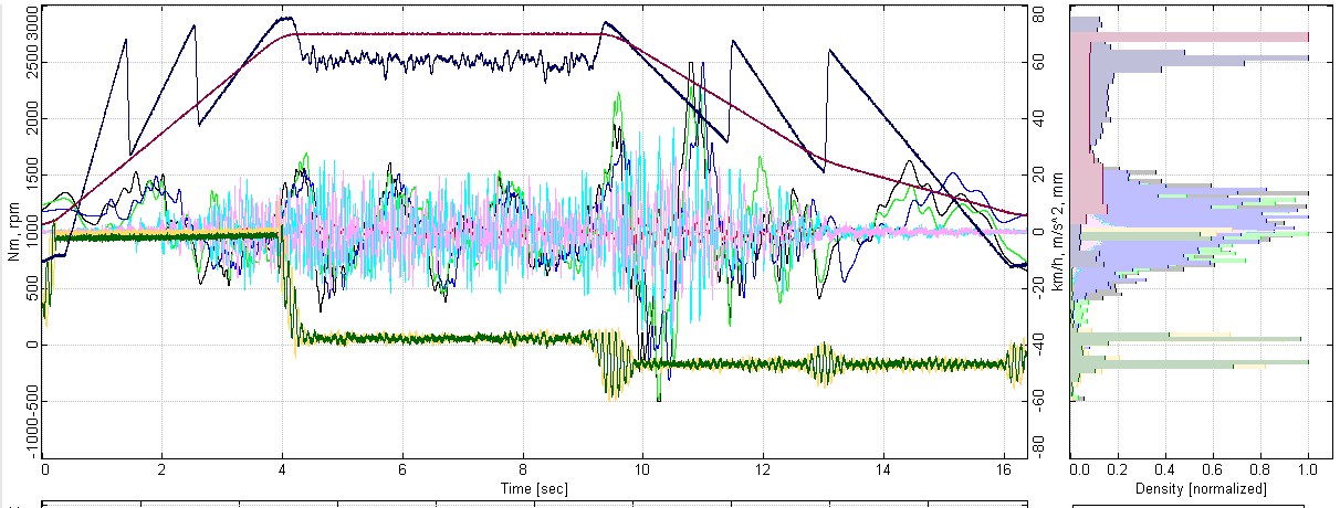
Engine speed in rpm on the left axis and wheel displacement in mm on the right, placed automatically

Automatic dual Y-axis

When channels span very different ranges, the large ones move to a second, right-hand axis so the small ones stay readable. There is nothing to set up.

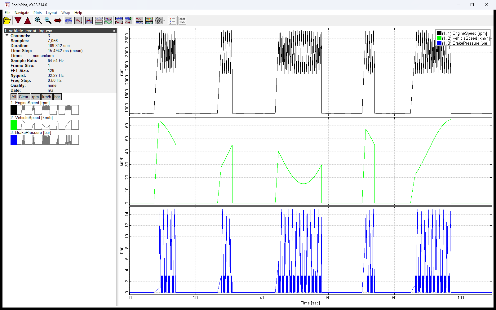
A CAN-style event log with bursts of messages separated by quiet gaps, each channel drawn at its own timestamps

Event data at its real timestamps

Files that aren’t sampled on a clock (CAN bus traffic, network messages, variable-step solvers) plot each sample at its own timestamp. Bursts and idle gaps show up where they really are and for as long as they really lasted.

Analyze

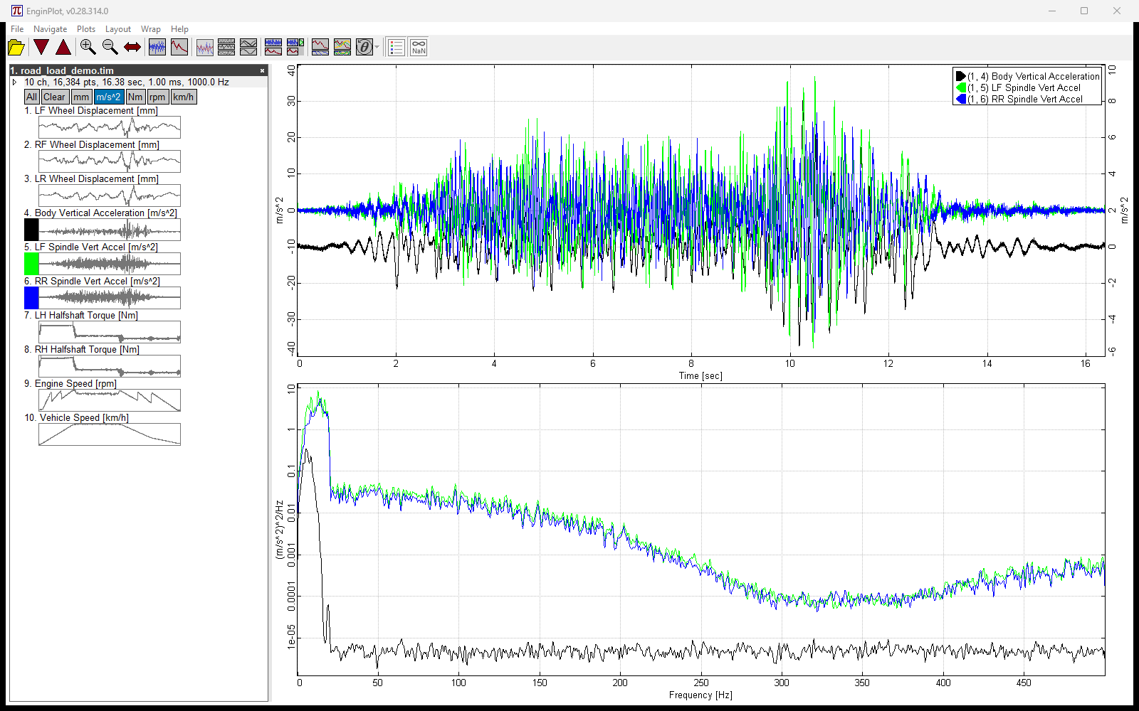
Three accelerometer channels shown as time histories above their power spectral densities

Time, frequency and histogram views

View time histories, power spectral density, or both together, with or without a histogram panel alongside.

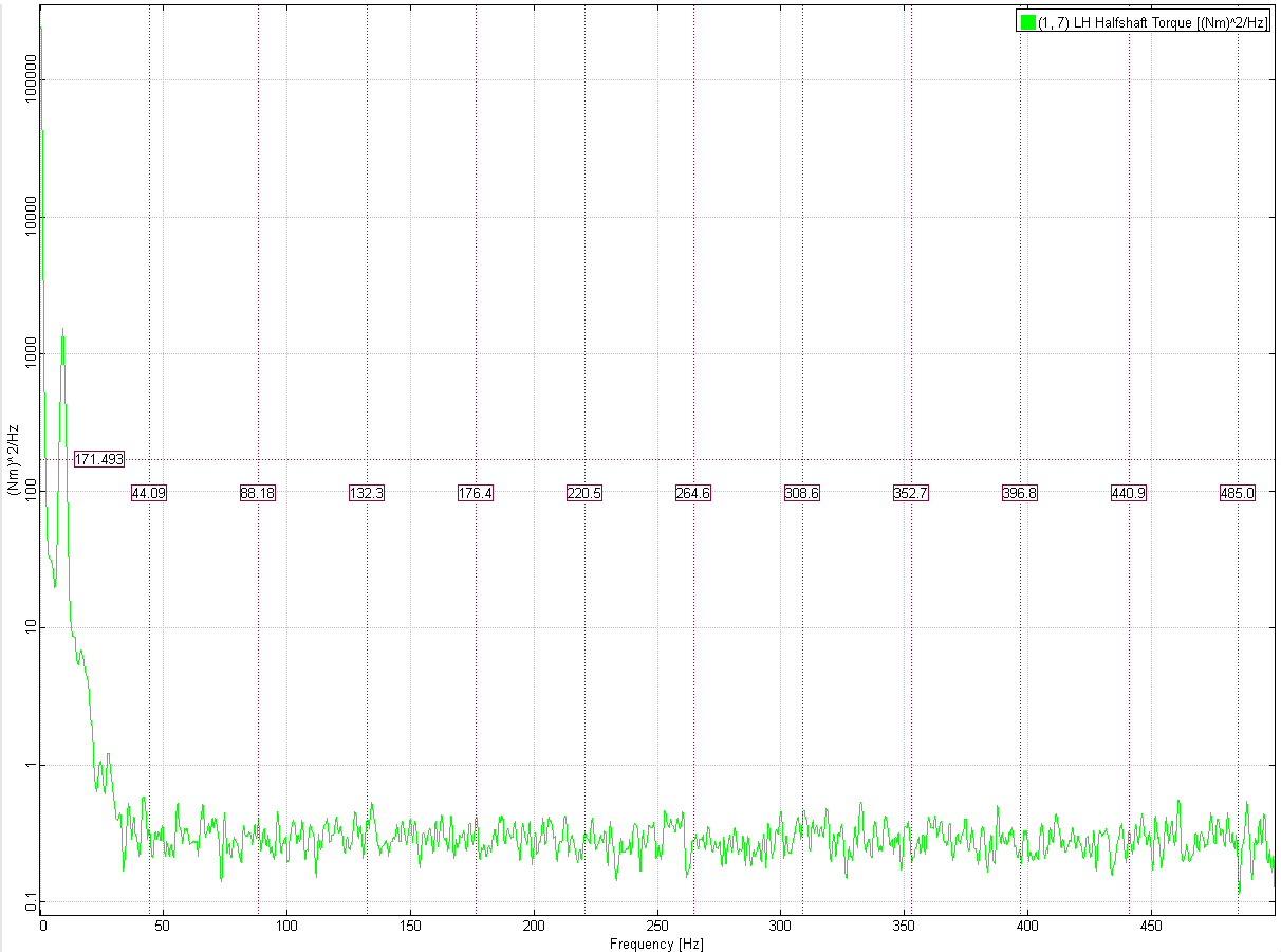
Each segment’s mean is removed before the transform, so a channel riding an offset shows how it varies rather than a spike at 0 Hz taller than anything it actually does.

How: Plots → Time, PSD, Time / PSD, or Time / PSD / Histogram.

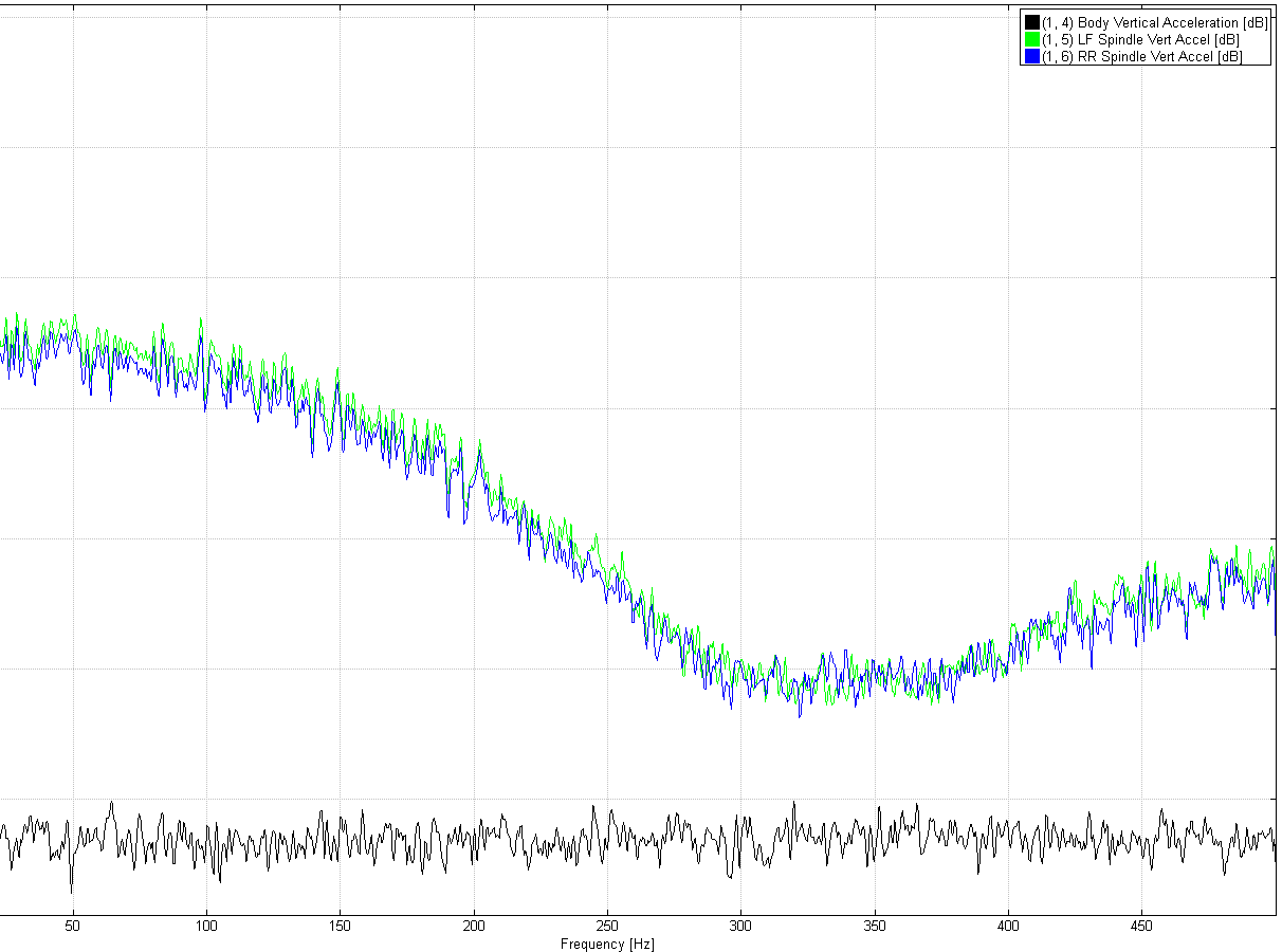
The three accelerometer spectra from the previous figure, now on a linear axis labelled dB, running from about +10 dB down to -60 dB, with the legend entries marked dB

Spectra in engineering units or decibels

The same three channels as above, now in dB. One switch moves every spectrum between engineering units and decibels: PSD plots, the PSD pane of the combined views, CSD overlaid and the magnitude rows of the CSD matrix. Axis labels, the legend and the cursor readout all follow it.

Decibels are 10·log10 of the spectrum, not 20, because a PSD is already magnitude-squared. Empty bins stay at −∞ and land on the plot’s −Inf rail rather than being floored to an invented number.

How: Plots → Spectra in Decibels, or the dB button on the toolbar. The choice is remembered between runs.

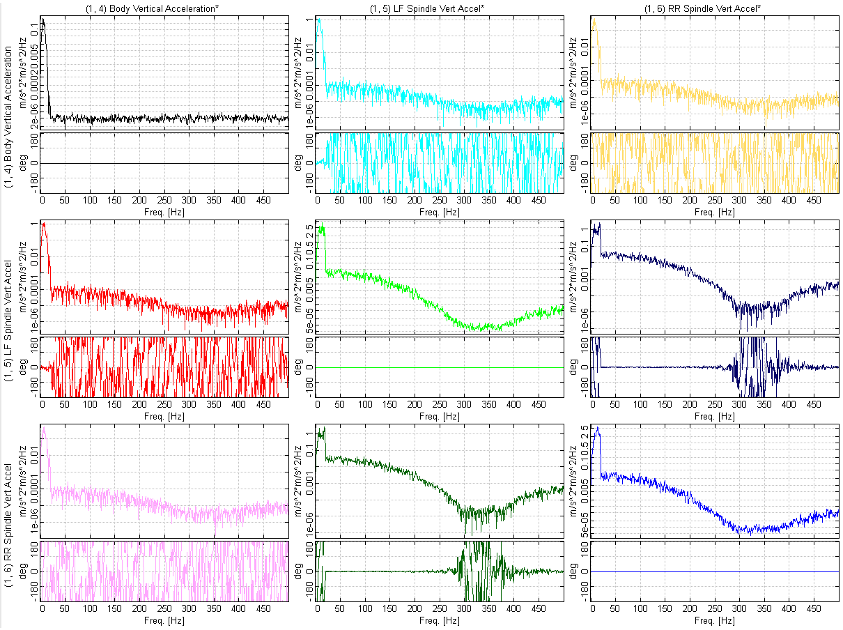
A three-by-three cross-spectral density matrix, each cell showing magnitude above phase wrapped to plus or minus 180 degrees

Cross-spectra with phase wrap control

Show cross-spectral density as a matrix of every channel pair, or overlaid on one plot. Phase can be unwrapped or wrapped to ±180°, 0 to 360°, ±360°, 0 to 720° and more.

How: Plots → CSD Matrix or CSD Overlaid; Wrap menu for the phase range.

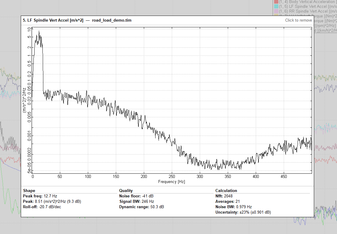
Pointing at LF Spindle Vert Accel on a PSD plot: its spectrum alone in the framed box, with three columns underneath reading peak frequency 12.7 Hz at 8.51 (m/s^2)^2/Hz or 9.3 dB and a roll-off of -20.7 dB per decade; a noise floor of -41 dB, 246 Hz of signal bandwidth and 50.3 dB of dynamic range; and Nfft 2048 over 21 averages with a 0.979 Hz noise bandwidth and plus or minus 23 percent uncertainty

Read a channel’s spectrum on hover

On a frequency plot the preview shows the channel’s spectrum instead of its time trace, on the same engineering-unit or decibel axis as the main plot, and reads it for you in three columns.

Shape gives the peak’s frequency and level, in engineering units and dB, and the roll-off above it in dB per decade. Quality gives the noise floor, the signal bandwidth — the highest frequency still 10 dB clear of that floor — and the dynamic range between them. Calculation gives Nfft, the number of averages, the noise bandwidth, and the random error the averaging leaves on the result.

A channel too slow for the bin spacing to resolve — a vehicle speed, a steering angle — is flagged Not a vibration channel, with the share of its variation sitting below that resolution, rather than being handed a peak that means nothing.

In the CSD plots the preview pairs the channel with every plotted channel from its own file: its own spectrum first, then its cross spectrum with each of them, following the main plot’s decibel and phase-wrap settings. A table underneath gives, for each pair, where the cross spectrum peaks, its level and phase there, the coherence at that peak, and a band coherence weighted so the frequencies where the two channels share power are the ones that decide it.

How: point at a channel row on any PSD or CSD plot.

Ten channels in a time-history plot beside their histograms

Histograms that measure time

Per-channel histograms show how much of the record each channel spent in each band. For event data, each sample counts for the time it covered rather than counting once, so busy bursts don’t drown out long quiet stretches.

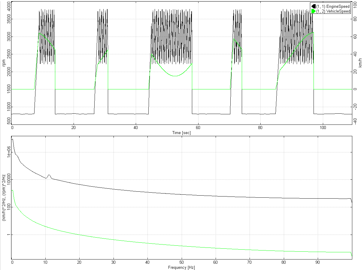
Time history and PSD of an event log; the frequency axis reaches 100 Hz, the rate inside the bursts

Meaningful spectra from event data

Unevenly sampled records are interpolated onto a uniform grid built from their own timestamps before the transform, with idle gaps left empty rather than filled in. The frequency axis reflects the rate the data really has.

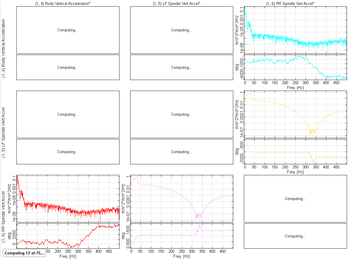
A cross-spectral matrix partway through computing: some cells drawn, others marked Computing, and a Computing 12 of 75 counter at the bottom left

Spectra computed in the background

Spectra, cross-spectra and histograms are computed on background threads as soon as a file loads, so switching views is usually instant. Cells still being computed say so, and panning, zooming and selecting keep working while they fill in.

Inspect

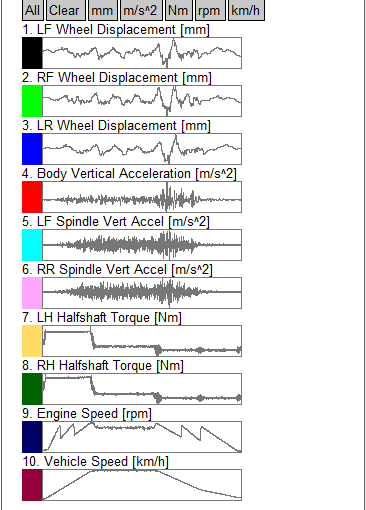
The file tree with a small preview plot beside every channel

Thumbnail previews

Every channel gets a small preview plot in the file tree, so you can see the shape of the data before you select it.

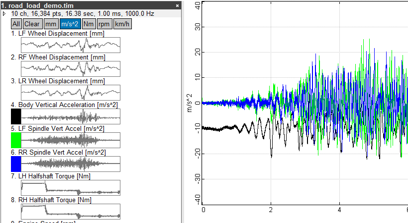
The m/s^2 unit button pressed, selecting the three acceleration channels, which appear in the plot

Select channels by unit

A row of buttons above each file’s channels selects all of them, clears the selection, or picks every channel with a given unit in one click.

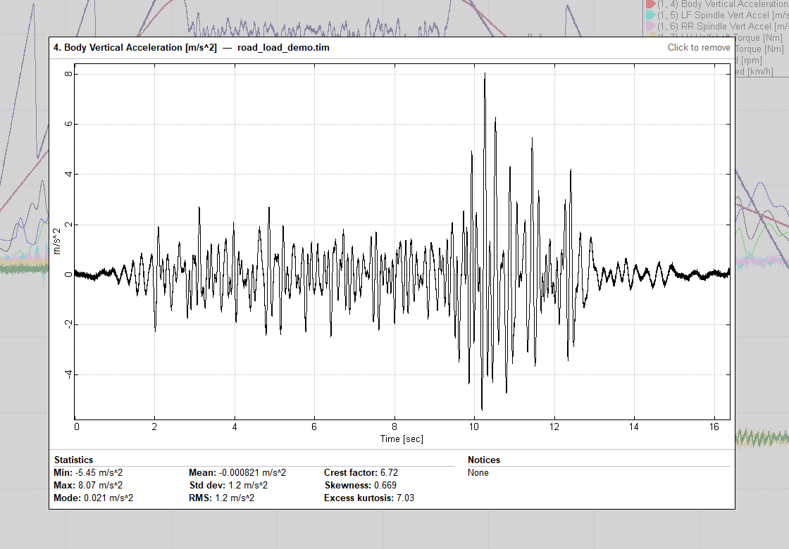
Pointing at Body Vertical Acceleration in the file tree: the channel is drawn alone in a large framed box over the middle of the plot area, the ten plotted traces dimmed behind it, with a Statistics panel underneath giving min, max, mode, mean, standard deviation, RMS, crest factor, skewness and excess kurtosis, and a Notices panel beside it

Preview a channel before you plot it

Point at a channel in the file tree and it is drawn on its own, in a large framed box over the middle of the plot area, with the main plot dimmed behind it. It follows the pointer down the list, so you can read through twenty channels without plotting any of them. The title bar says what a click will do — Click to add or Click to remove.

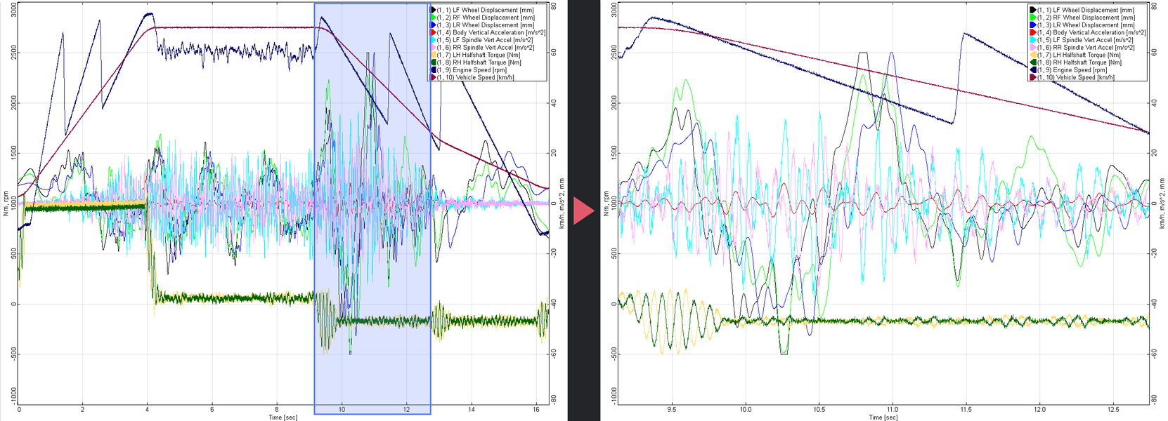
The preview always shows the whole record. When the main plot is zoomed in, the zoomed span is shaded on the preview, so it doubles as a map of where you are in the file.

Underneath, a Statistics panel gives the channel’s minimum, maximum and mode; its mean, standard deviation and RMS; and its crest factor, skewness and excess kurtosis. They are taken over the finite samples only, and the heading says so on a channel that has NaNs or infinities. A recording with its own timestamps is weighted by how long each sample was held, so a burst of messages does not outweigh a long steady stretch. A Notices panel beside it lists the channel’s data-quality warnings with their counts.

On a large file still being worked out, the figures show as “…” and fill in on their own — the channel you are pointing at is moved to the front of the queue.

How: point at a channel row. Nothing to turn on.

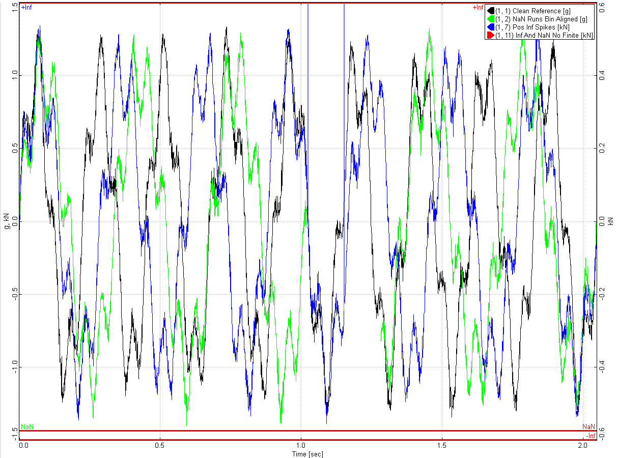
A time plot with a +Inf line under the top edge, a -Inf line along the bottom and a NaN row above it, each carrying coloured marks where a channel has those samples

NaNs and infinities get their own rail

Values a Y-axis cannot show are not dropped and do not wreck the scale. Each plot reserves a +Inf line under its top edge, a −Inf line along the bottom and a NaN row just above it. Every affected channel marks the rail in its own colour, at the time it happened, so you can see which channel went bad and when while the finite data keeps the full height of the plot.

The rails are per axis, so a dual-axis plot annotates left and right separately, and they only report what is in the window you are looking at.

How: Plots → Show Non-Finite Values toggles it.

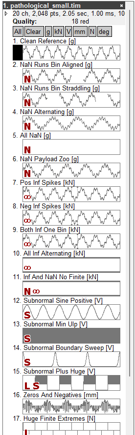
Channel thumbnails marked N for NaN, an infinity sign, S for subnormal and L for huge values, with a tooltip breaking down one channel: 1,024 large and 1,024 subnormal samples

Data quality at a glance

Every channel is checked as it loads, and what it fails is drawn as a letter beside its thumbnail: N for NaNs, ∞ for infinities, L for values too large to have come from a real transducer (above 1e12), S for subnormals — numbers so close to zero that they have lost precision — and a flag for a dead channel that never changes value.

Pointing at a channel gives the breakdown, in the preview’s Notices panel: how many samples each check caught and what fraction of the channel that is. The file row totals it up, so a file says “18 red” before you open a single channel.

Hovering one legend entry: the Body Vertical Acceleration trace stays bold while the other nine traces fade

Interactive legend

Hover a series to highlight its trace, left-click to bring it to the front, right-click to remove it from the plot.

How: Plots → Show Legend toggles it.

Scale & deploy

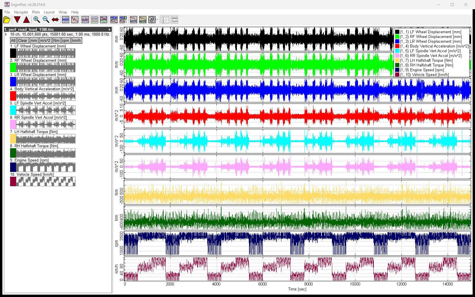
150 million points: ten channels of fifteen million samples each, stacked one per row

Built for scale

Zoom, pan and redraw stay smooth at 150 million plotted points. A 600 MB, ten-channel fstrm recording loads in about half a second. Shown: ten channels of fifteen million samples each.

Zero install

One self-contained, signed .exe of about 1.3 MB. No installer, no dependencies, no companion DLLs. Runs on Windows 10 and later.

It remembers its window position, size and splitter between runs in a small settings file under %APPDATA%\EnginPlot.

All screenshots use synthetic data.